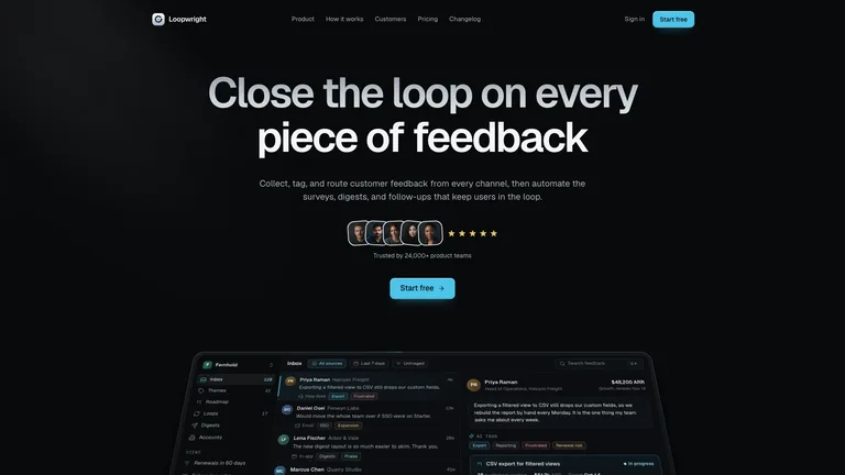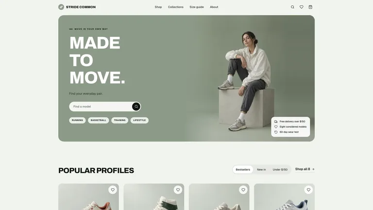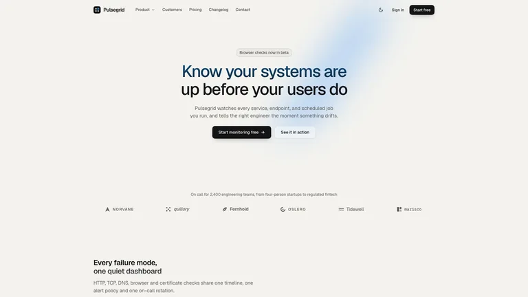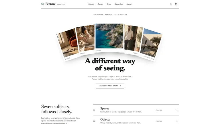
Anyone who has asked Claude, ChatGPT, Cursor, or Lovable to build a website knows the feeling: it generates a full page in 30 seconds, yet visitors can tell in half a second that AI made it. Glowing purple gradients, pitch-black cards with heavy drop shadows, and row after row of three tiny icons—it looks too generic to trust with a real business.
AI isn’t actually bad at design. It just falls back on the most overused internet templates whenever you don’t give it clear visual taste.
After comparing 100+ generic AI landing pages against 29 studio-grade designer website templates, we narrowed the “cheap AI look” down to 7 easy-to-spot habits. You don’t need to know CSS to fix them—we’ve included a ready-to-copy plain-English prompt at the end you can paste straight into your favorite AI builder.
The short answer
| Classic “cheap AI website” habit | What real designers do instead | Immediate visual upgrade |
|---|---|---|
| 1. Blue-to-purple gradients everywhere | Pick 1 crisp brand color (cobalt, warm orange, mint, forest green) | Instantly stops looking like a clone template |
| 2. Harsh #000 black + muddy drop shadows | Warm off-white paper or soft charcoal + thin hairline borders | Calm, editorial feel instead of heavy boxes |
| 3. One plain default font for everything | A distinctive headline font paired with clean body text | Gives the page real personality right away |
| 4. Crowded top screen + fake box “dashboards” | Max 4 items on the first screen + a real screenshot or photo | Clear focus and real credibility |
| 5. Tiny pill badges above every single heading | Drop 80% of pill labels (use at most 1 every 3 sections) | Stops feeling like a repetitive form |
| 6. Endless rows of “3 equal icon cards” | Alternate split layouts, big visuals, and clean comparison lists | Keeps visitors engaged as they scroll |
| 7. Buzzword slogans full of em-dashes (“—”) | Cut the em-dashes; state specific time saved or concrete results | Sounds like a real human built it |
1. Mistake #1: Purple gradients everywhere → Pick 1 clean brand color
Why do nine out of ten AI websites default to indigo-and-purple gradients? Because thousands of free SaaS templates used those exact colors for years, and AI models copied them to death.
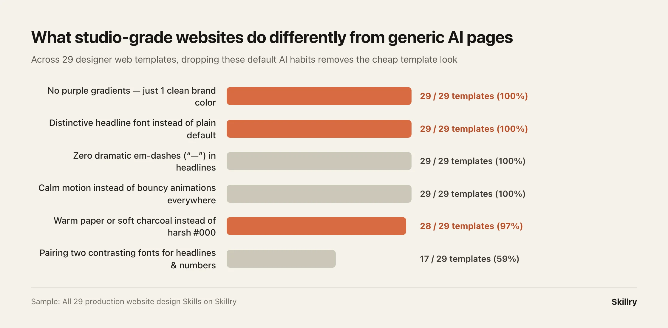
Across all 29 studio-grade templates on Skillry, not a single one uses a blue-purple gradient (0%). Simply tell your AI: “No gradients anywhere—use one clean accent color only on primary buttons and key highlights.”
2. Mistakes #2 & #3: Harsh black boxes + plain default fonts → Soft surfaces & expressive headlines
Generic AI pages love pitch-black (#000000) or glaring white backgrounds, heavy dark shadows around every card, and one bland default font from top to bottom.
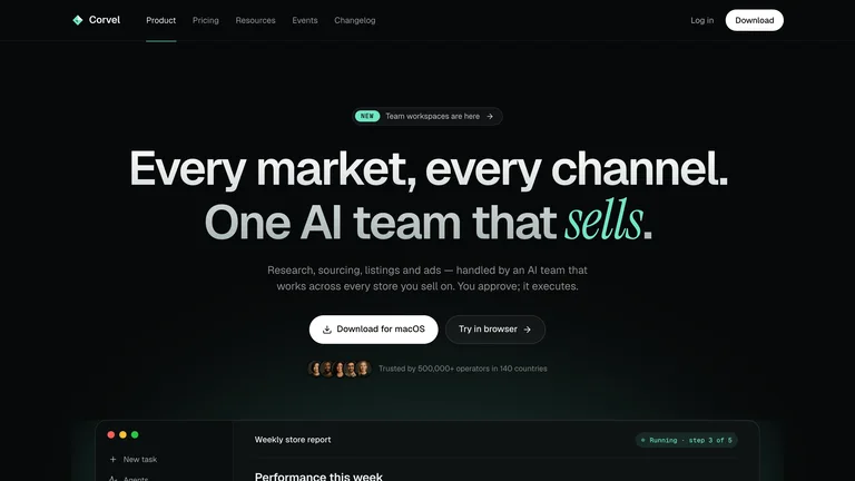
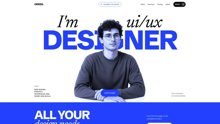
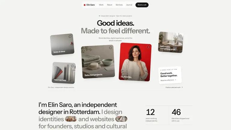
Compare three AI-built sites using curated design systems—from left to right: Mint Noir SaaS, Cobalt Serif Portfolio, and Bento Designer Portfolio:
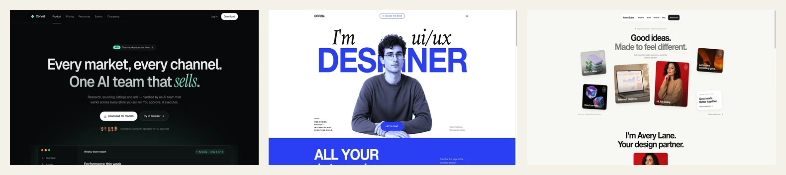
Notice three simple differences:
- Dark pages use soft charcoal, and light pages use warm paper off-white—never harsh extremes.
- Thin, subtle borders replace muddy drop shadows.
- Headlines use a font with character, giving the brand an unmistakable voice in two seconds.


3. Mistake #4: Stuffing the first screen—and letting AI draw “fake dashboards”
When you don’t provide a product screenshot, AI loves inventing a fake dashboard out of colored rectangles and pretend charts right at the top of your homepage, surrounded by eight floating badges. Visitors spot fake UI immediately.
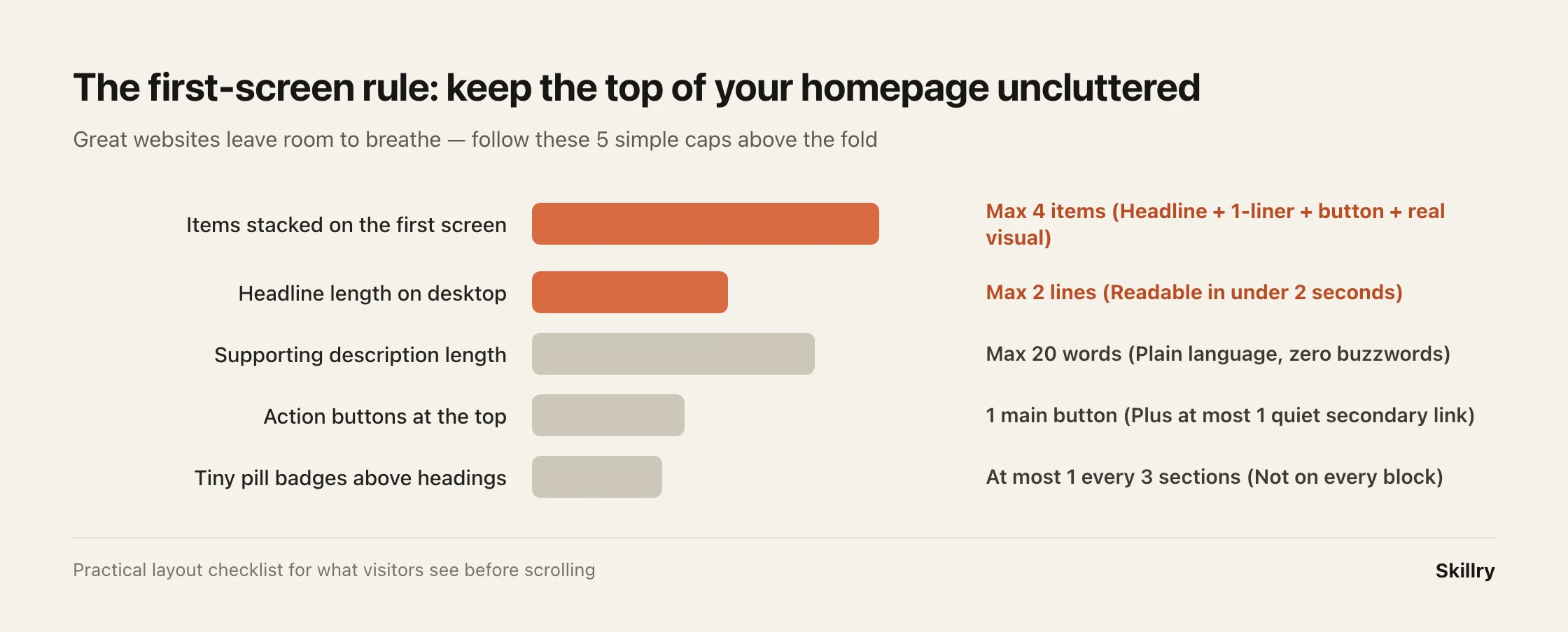
Follow the First-Screen Rule—before scrolling, show at most 4 things:
- A 1–2 line headline saying clearly what you do;
- One short plain-English sentence (under 20 words);
- One primary button;
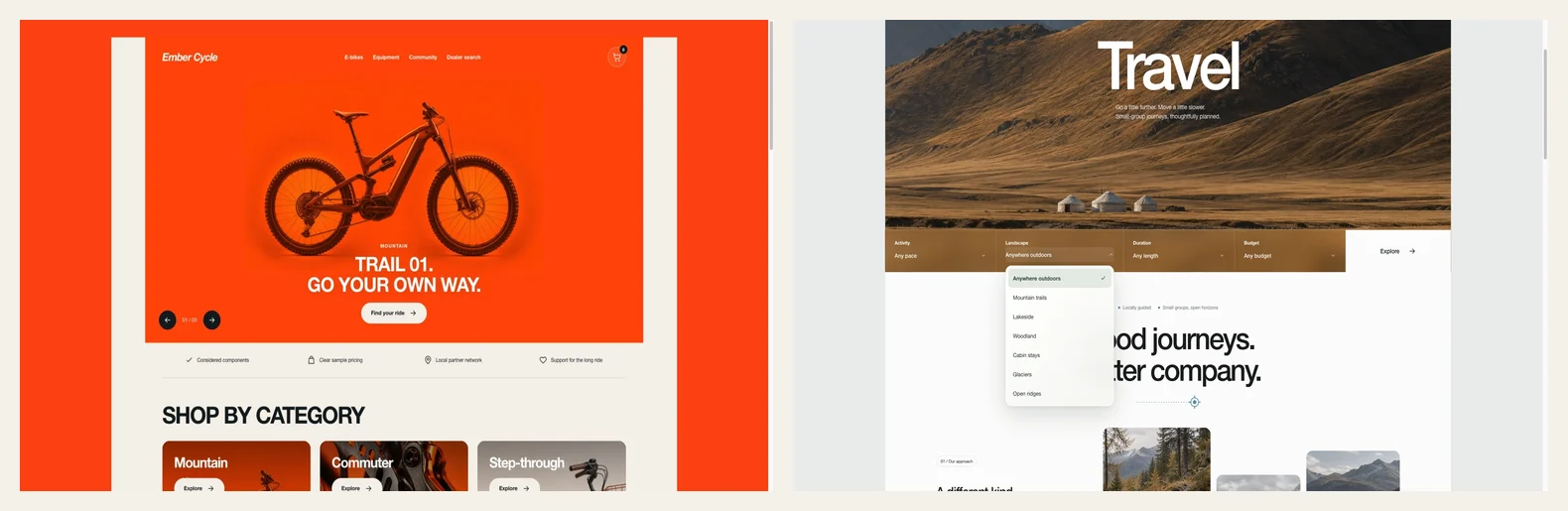
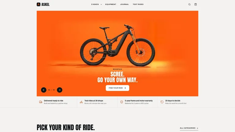
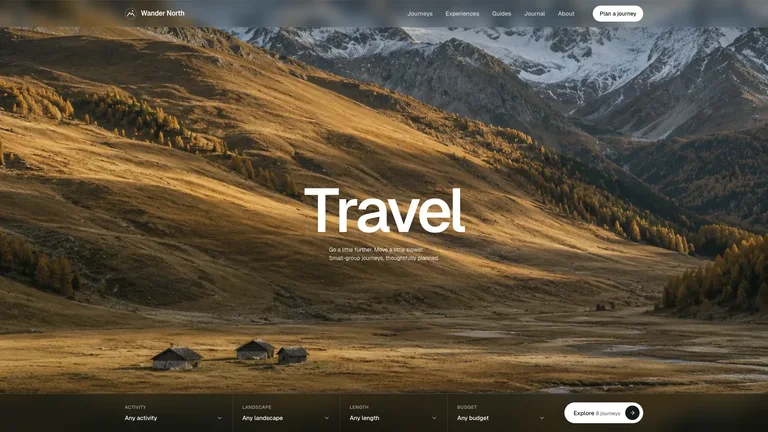
- One real product screenshot or bold photograph (like Ember E-bike Store and Alpine Travel Landing below).
4. Mistakes #5, #6 & #7: Drop the pill badges, 3-card clones, and “AI slogan” copy
As visitors scroll down, three more habits scream “AI generated”:
- Pill-badge overload: Stop putting a tiny uppercase capsule (“FEATURES”, “WHY US”) above every single section title.
- Three-column icon fatigue: Never stack two “3 equal cards with circle icons” sections back to back. Mix a left-right split section, a clean comparison table, and an asymmetric gallery.
- Dramatic em-dash slogans: AI loves writing “Not just a tool — your intelligent copilot for tomorrow.” Delete the em-dashes (—) and write concrete facts: “Send client proposals in 3 minutes instead of 2 hours.”
5. Copy & paste: The “No AI Look” prompt for any website builder
Paste this block straight into Claude, ChatGPT, Cursor, Bolt, or Lovable alongside your project idea:
Build this website following these 5 design and copywriting rules so it looks like a custom studio site, not a generic AI template:

1. Clean color palette: Do NOT use blue/purple gradients or glowing neon text. Use a warm off-white paper background (or soft charcoal for dark mode), pick just 1 crisp accent color for primary buttons, and use subtle 1px borders instead of heavy drop shadows.
2. Distinctive typography: Don't use a single plain default font everywhere. Choose an expressive display font with tight letter-spacing for headlines, paired with clean readable body text.
3. Uncluttered first screen: Show at most 4 elements above the fold (a 1–2 line headline, one sentence under 20 words, 1 main button, and my real product image or photo). Never invent fake UI dashboards out of placeholder boxes.
4. Varied page rhythm: Do not repeat "3 equal icon cards" in consecutive sections, and don't put tiny pill badges above every heading. Alternate between split text/image sections, a clean comparison list, and bold visuals.
5. Human copywriting: Zero em-dashes ("—") in headlines, and zero vague buzzwords ("revolutionary", "supercharge", "next-gen"). Use plain, specific language about what the product actually does.
Want to skip prompt tweaking altogether? Install a ready-made designer website Skill in Claude Code or Cursor—like Mint Noir SaaS, Cobalt Serif Portfolio, or Bento Portfolio (or browse more in Web Design Skills)—where all seven rules are already built in.
FAQ
Does this prompt work in Lovable, Bolt, Cursor, and regular ChatGPT? Yes. Every AI coding or website tool responds immediately to concrete visual and copy rules like these.
What if I don’t have a finished product screenshot yet? Use a clean typography-focused hero or one authentic photograph until your UI is ready—never let the AI fill the gap with fake placeholder charts.
Fastest way
Ask your AI to do it
Paste this into the AI agent you already use:
I want to build a clean, studio-quality website without the generic "AI template" look. Ask me what my product or business does and whether I prefer a warm light look or a sleek dark look, then design the page avoiding purple gradients, fake UI mockups, repetitive 3-card rows, and buzzword em-dashes.
Designer-crafted website templates without the AI look
Preview live outputs right on each card, then install in Claude Code, Cursor, or Codex in minutes.